article
4 September 2025
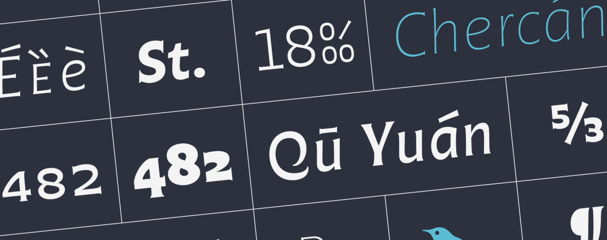
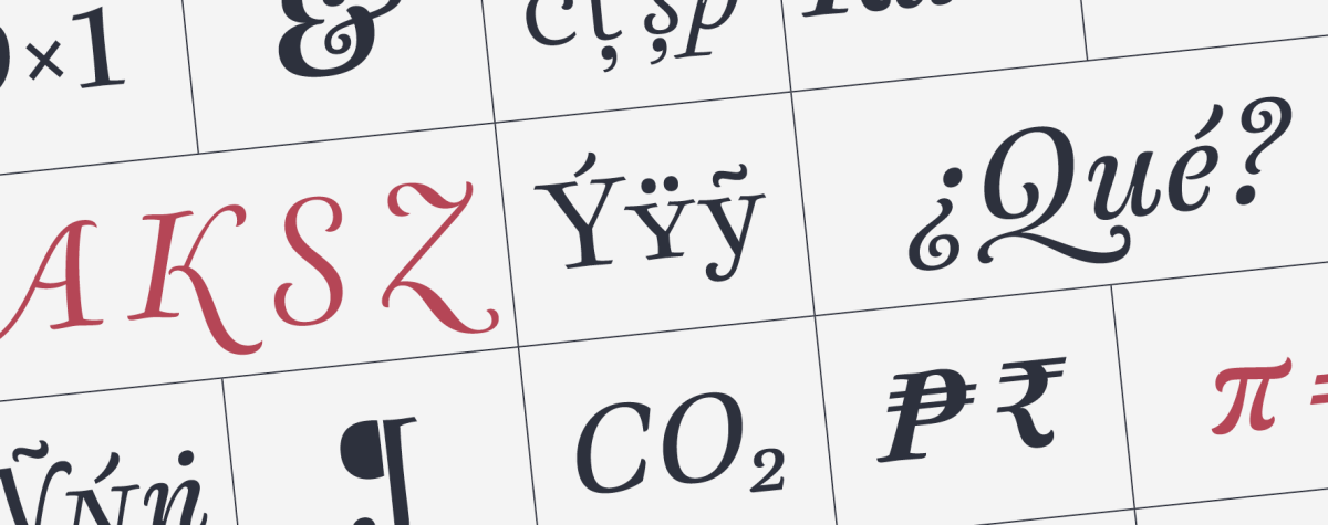
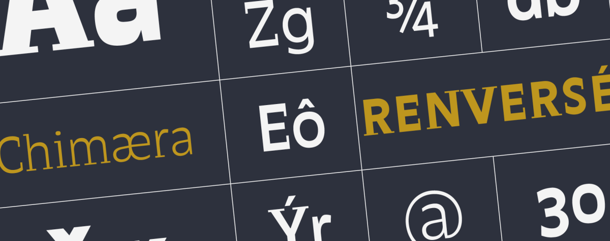
When choosing a font for the layout of his own book, «Hacer y Componer» («Making and Composing»), Francisco Gálvez decided that the best option would be to design a new typeface that would respond well to the requirements of the book, such as the coexistence of different scripts from around the world on the same page. The result of this design process, which ran parallel to the book’s gestation, is the Otta typeface that we present here. Otta is a versatile design that integrates a dynamic sense of writing (both calligraphic & typographic) with an essence that could be described as artisanal, like hand-drawn lettering. The latter is experienced as a personal reaction to the often unthinking acceptance of the advance of AI as a consumer good. Francisco shares valuable milestones in the self-taught journey he took to design Otta, a family that now includes extended versions of Arabic, Cyrillic, Greek, and Latin panUnicode. He also reveals secrets of type design, in this case closely linked to book design, two crafts that the author practices with passion. Otta is undoubtedly Francisco Gálvez’s masterpiece to date. Here are the motivations & challenges that guided him in the design of this typeface. Read