Release note
2 February 2022
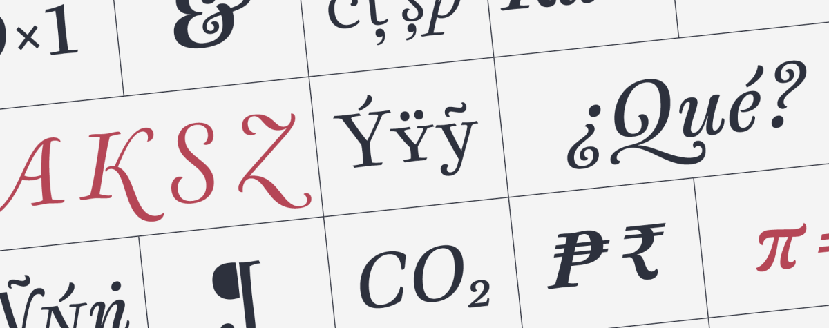
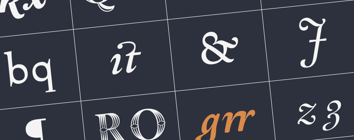
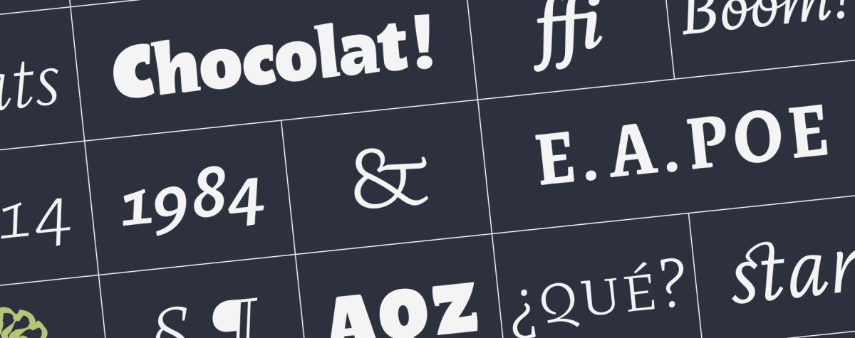
We are proud of this project: The design of a typeface for the Universidad Nacional de Córdoba in Argentina, an educational institution of more than 400 years, the first in the country and one of the earliest in the continent. As part of the celebration for the hundred years of the University Reform, which occurred in this house in 1918, the UNC commissioned PampaType the design of a typeface to address their multiple communication needs. The resulting design, ‘Reforma’, is a multi-form family with diverse styles. In this article we share a bit of context, all the design process, some of our drawings and production details, and a few insights harvested throughout this 3-year fruitful experience. Read
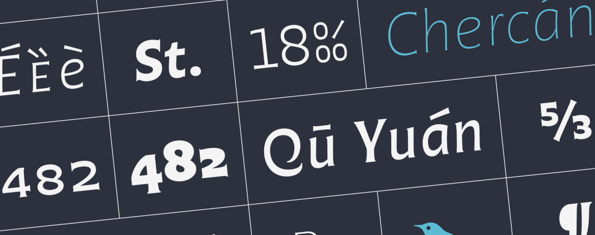
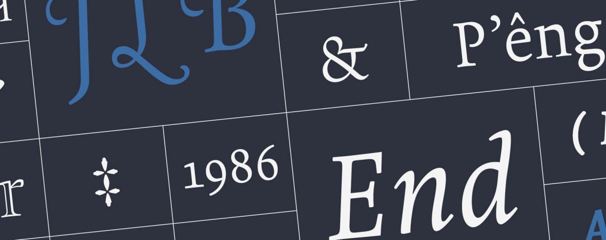
This typeface is named after the astonishing guitar player and singer Atahualpa Yupanqui, a central figure to Argentine folk music. ‘Don Ata’, as he was called, was a wise poet with a particularly sensitive view of the elements of nature as well as of the human condition, all of which he turned into compelling lyrics and magic songs. For years I dreamed about designing a typeface in his name. I imagined a firm, rough voice, though interpreted with delicate curves and a feel of warmth. After a few years of occasional sketching finally a spirit aroused in 2014. The initially vague forms turned into precise letterforms and with time into a family of fonts. Now the type Atahualpa finally sees the light. I’m happy. Here I invite you to unveil all the secrets behind the scene, discover the clues of the inspiration and the design process, and enjoy some footnotes from our design kitchen. Read