{Author’s note: Only when pertinent I’ve decided to support the text with illustrations. Images of matters mentioned here can be otherwise found in numerous sites and publications.}
Reading
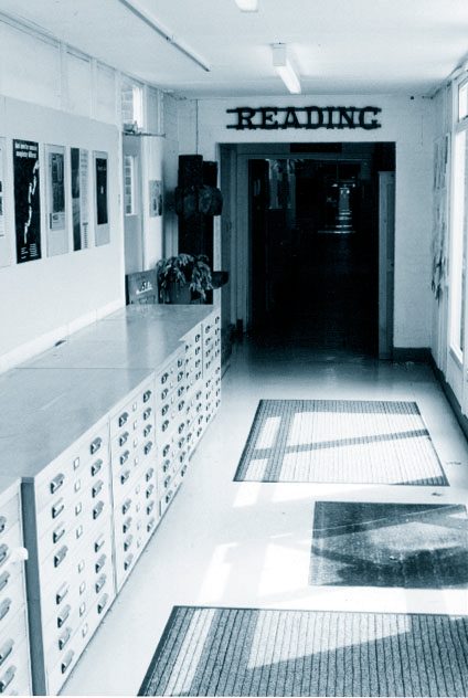
Gerard was my professor during the course of my masters degree in typeface design at the University of Reading between 1999 and 2000. It was the MA’s first year, Christopher Burke served as director, and Unger had been hired as a visiting professor. Many of his and Burke’s lectures where shared with the students (strangely enough all women) of the MA in type theory and history. In our incipient MA we were only two students, guinea pigs, Vincent Connare and me. Gerard’s visits spanned every two weeks and lasted three days at a time. Within that period Gerard imparted his lectures and remained generously available to review our projects, comment on our writings, and also to talk about anything.
Over the years I began to realize just how lucky we had been. On many occasions, after conversing about our own projects and papers, topics parted casually towards trips, music and food. You could tell that he enjoyed learning about the origin and culture of his students. My project at that time, Rayuela, captivated him insofar its connection to a literary universe (in this case Cortázar’s homonymous novel) and I recall how Gerard relentlessly tried to pronounce ‘Rayuela’ stressing the ‘y’ as it where a ‘sh’. I would then explain to him the difference in pronunciation between an Argentinian from Buenos Aires and one from Córdoba: My friends in Buenos Aires are unable to detect the difference between a ‘Sean’ Penn and a ‘John’ Lennon. These sorts of subtleties captivated Gerard and he got them right away. In Amsterdam’s bookstores I would later begin to understand the Dutch’s sense of cultural belonging, themselves having been harassed by surrounding powers, and their justified pride in defending their culture and language throughout the centuries. Years later, having better understood the Dutch graphic and typographic contribution to the international scene, I would pass that on to my own students. One of the key pieces in that jigsaw puzzle is, without a doubt, the one of Gerard Unger.
Amsterdam
In 2000 I had my very first and curious trip to Amsterdam. Among several places I visited Den Bosch down south, meeting Hans van Leeuwen and Marie Therese Koreman, heads of Visualogik, a digital font production company. They were showing me pencil drawings done by the great José Mendoza when all of a sudden the phone rings, it was Unger. Hans tells him a student of his (I) was there, Unger says put him on: ‘Alejandro, what on earth are you doing there!?’, a funny reaction to such unexpected news. I told him I’d met the Visualogik team in Barcelona once with Rubén Fontana and Wolfang Hartmann (Neufville Foundry). In 1997 Visualogik had developed a typeface for the road signs in Holland (ANWB) together with Gerard and also helped him with the post-production of his fonts. ‘Ok then, when you’re back in Amsterdam give me a call.’
Gerard was very nice to me back then and our meeting was positively enlightening for me. He took me to the social club he used to go to (I’ve obviously forgotten its name), a classy but bohemian place where poets and artists frequently gathered to drink and save the world. Unger smoked a cigar as he introduced me to his entourage as his Argentine student in Reading. His teaching trips to England had recently begun and it was evident he enjoyed talking about that with his colleagues. After a while of me not understanding a word of Dutch, we left to have lunch in a very popular restaurant where they served the best fish in town. The tablecloth was made of paper and we used it to draw and explain things. Conversations went on about personal preferences and life. Unger was happy to know that I’d worked at newspapers and magazines in Buenos Aires before heading to Reading. He told me: ‘Alejandro, you should definetely take advantage of that experience and design fonts for newspapers!’. Finally he asked me if I minded getting wet, ‘of course not’, so we walked silently several blocks under the intense rain so common in that region of the world so little benefited by the weather. He stopped me at a corner. ‘I thought you might be interested in seeing this’ he told me pointing high at a plaque that said (very clear in Hungarian and Dutch) that in that building the great Miklós Kis had worked and lived. As it is well known, the legendary Transylvanian punch cutter and printer cut a beautiful face in that very place, considered by many to be quintessentially Dutch baroque, and it is probably the type most used in the West to compose literature. 1 Unfortunately I didn’t have my camera with me (in the year 2000 mind you cell phones were quite a long way away), and when I returned the following day having promised myself to find that very same corner, I lost track, got late, and almost lost the plane back home.

Gerard professor
Unger versed about what he liked or was a personal reference in his life. In it he showed a great passion and talent to transmit, as well as an insightful sense of humor which helped to transmit, not only the information, but also the passion itself. I believe that having fun teaching classes, besides being a sign of health, helps students to understand and feel closer what sometimes looks distant. Assess and show the human aspect of an admired designer, that was something very important for Gerard, and he did it perfectly. He was also a provocateur by nature. Everyone around him was cordially invited to leave their comfort zones and be rocked to their very bones. And the enthusiasm and passion he gave to his presentations, particularly when talking about his referents in design, has surely made a deep impact in the ones who later became teachers.
Some of Gerard’s advices are unforgettable, for example when referring the design of the black weight of our typeface, he recommended us consuming large amounts of dark chocolate to ensure the design turned out all right.
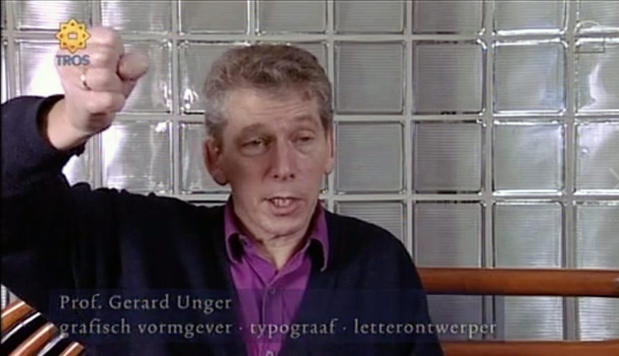
A couple of interventions that speak very well of Gerard are available to all in the short film about the œuvre of Bram de Does entitled Systematically Sloppy. 2
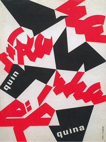
Among those admired by Gerard are the French sign makers and he held them dear because they populated the landscape of his childhood vacations. The message of Quinquina St-Raphaël of Charles Loupot was clearly his favourite image. Then came Excoffon and Dwiggins, of whom I guess he admired their sense of rebellion, to which he probably felt in tune with.
Excoffon
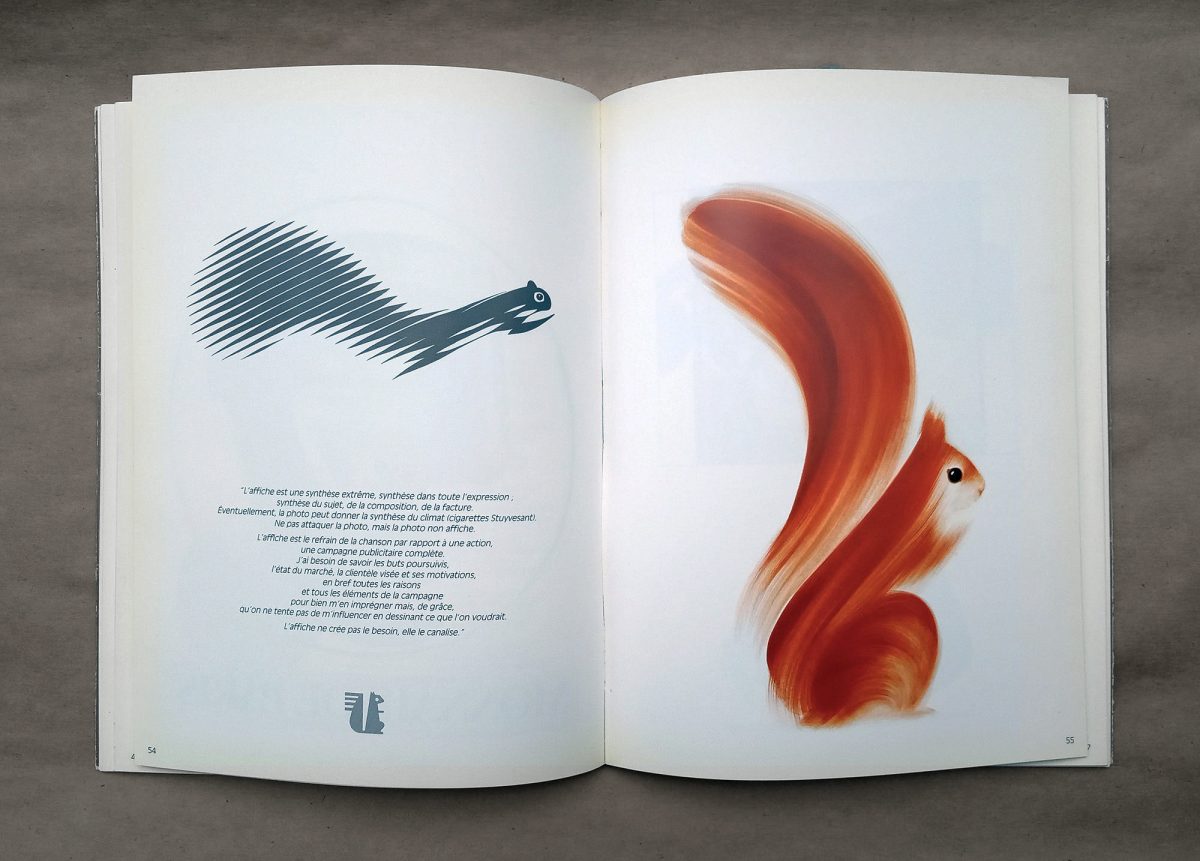
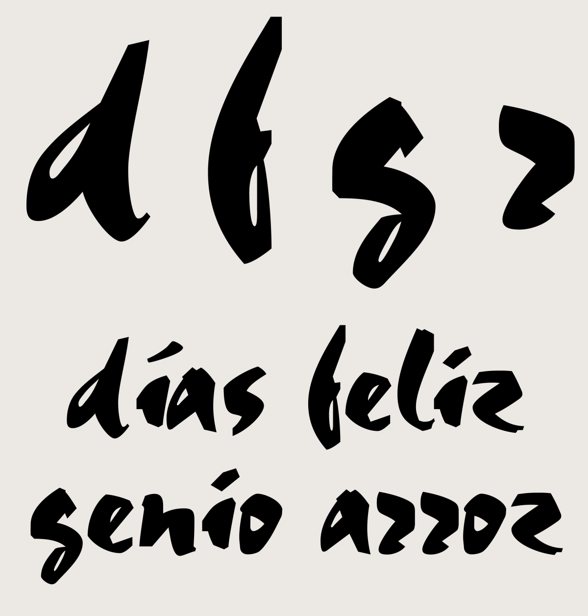
Roger Excoffon, with all his graphic and calligraphic brush-like quality, for his obsession with velocity and his hunger for reforming the French type scene, was one of Unger’s greater idols. Also, the fact that Excoffon had been so timely in publishing his designs (through the Olive foundry, owned by his brother in law Marcel Olive) and having them spread out so successfully throughout France, particularly in store signs. Unger would say that Excoffon would end up being responsible for the corporate identity of the French countryside. And then he would especially emphasize on Antique Olive, he was always surprised and intrigued by the great legibility it showed in small sizes. Without a doubt my own interest in Excoffon and his work began in that very special lecture that Gerard gave about him. 3 Some time later Sébastien Morlighem together with Sandra Chamaret and Julien Gineste would produce a great book about Excoffon, edited by Ypsilon, with a burning prologue by Gerard Unger. If it had not been by the enthusiasm that Gerard exhibited when showing Excoffon’s work, probably none of this would have occurred.
Dwiggins
Another one of Unger’s favorites was William Addison Dwiggins (WAD), whose personality is nowadays very well accounted for in numerous publications, in particular the astounding book by Bruce Kennet. 4 Having said this, in the year 2000 there was not much to be found on Dwiggins, other than the two small volumes Postscripts on Dwiggins by the Typophiles, a chapter in Walter Tracy’s book Letters of Credit, and a few articles.
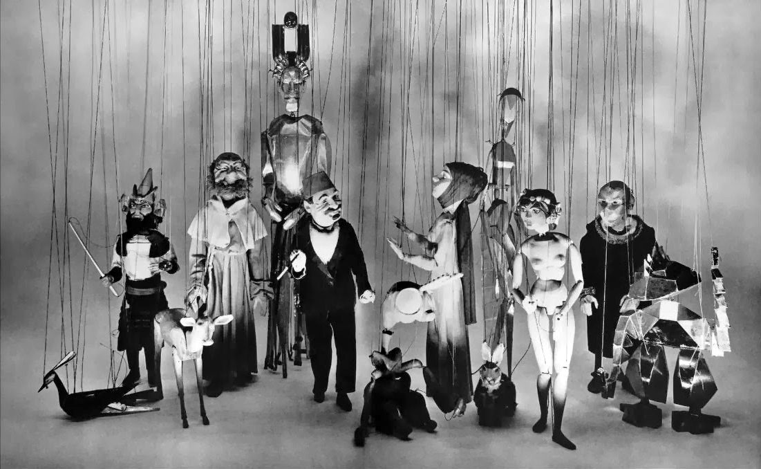
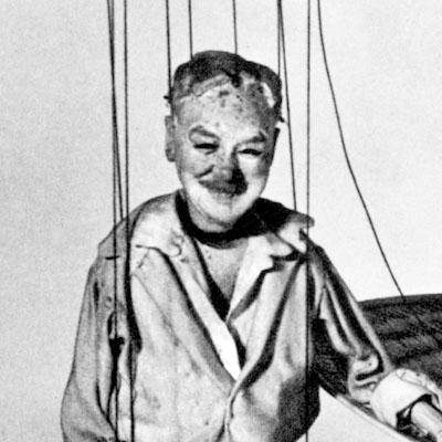
Gerard started his lecture on WAD by telling that once in a bookstore in New York, while he asked the clerk if he had anything on Dwiggins, a client that stood next to him overheard them and said ‘That’s funny, I’m also looking for a book on Dwiggins, wasn’t he a great puppeteer?’. Gerard confidently responded: ‘No, madam, you are mistaken, the Dwiggins I’m looking for is a typographer and an illustrator’. To which the lady replied: ‘No! You are mistaken, it’s the same William Addison Dwiggins, typographer, illustrator and great puppeteer’, after which they asked the bookstore keeper the fantastic book on puppets edited by Dorothy Abbe, close friend and secretary of WAD. With the same sense of awe Unger would explain, masterfully, the ‘marionette effect’ or simply the ‘M effect’. After years of work WAD would discover, while creating the heads of his puppets, that if he applied curves that were hard and angular instead of soft and continuous, the faces of the characters would capture the light more effectively and their expressions would therefore be better ‘read’ at a distance. (For example in the very last rows of the theatre, where WAD probably sat –and this is my assumption– because, even though he was the director of the show, he was more of an introverted kind of person. He actually made a puppet of himself to wave at the end of each play.) WAD would then incorporate this very principle into the design of his typefaces. This is perhaps better appreciated in Electra.
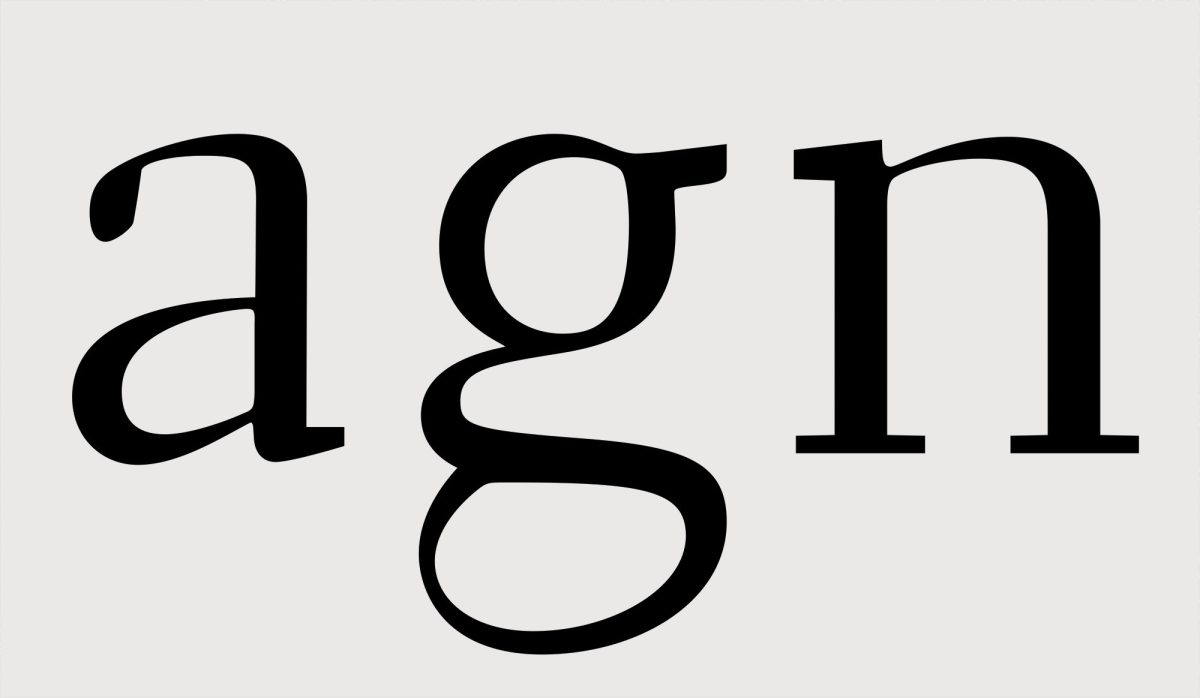
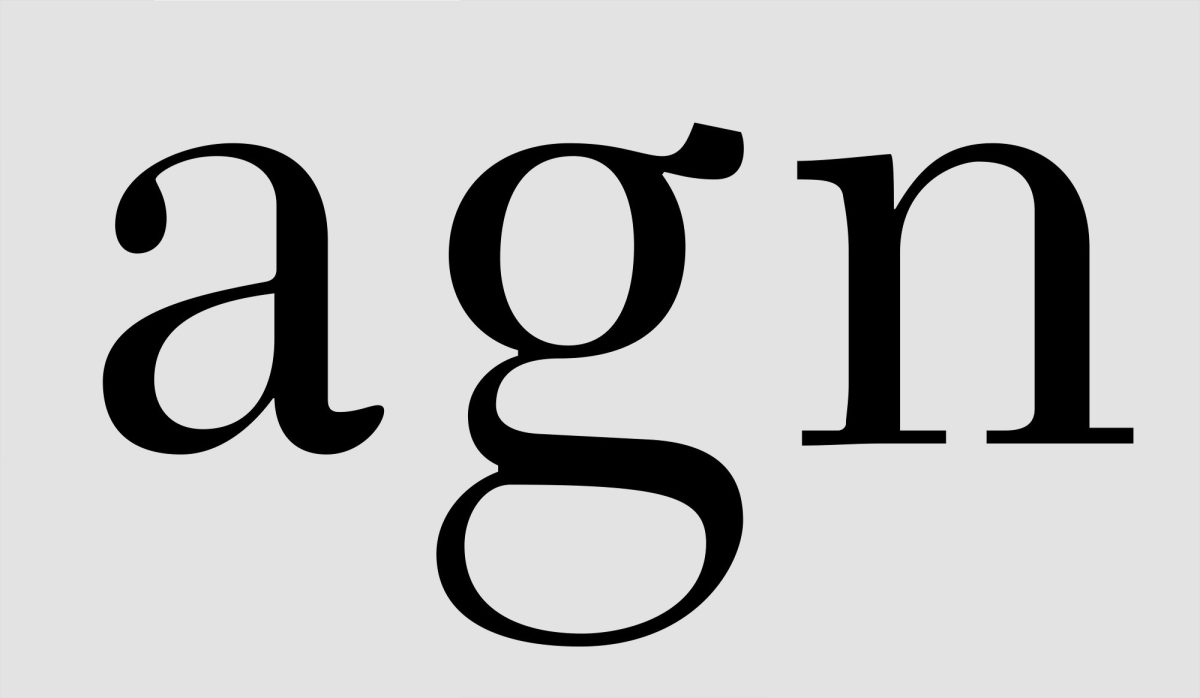
Two famous typefaces for books by WAD: Electra to the left, Caledonia to the right. In Electra the ‘marionette effect’ is drastic, the upper ring in g does not continue naturally its modulation. The arc of n is super horizontal. In Caledonia the M effect is moderate: the ending stroke of a has a weight and mass intentionally incongruent with the ring. The final ensemble in the tail of g does not ‘respect’ a calligraphic pen logic. In n, the encounter of the arc with the right stem leaves a round exterior curve and a squarer interior, etc. Unger recognized in WAD one of his great influences.
Unger’s huge admiration for WAD is well expressed in the article he wrote “Experimental No. 223, a newspaper typeface, designed by W. A. Dwiggins”, where he refers to historical, technical and design aspects of the so called ‘legibility group’ (the series of types produced by Mergenthaler Linotype for newspapers, to be used with linotype machines, obviously), but he also goes on to talk about human aspects, like the crazy correspondence WAD kept with Chauncey Griffith (‘Griff’), head of typographic development at Mergenthaler Linotype, which went on for 20 years. The interest Dwiggins showed in designing a type for newspapers seems to have continued naturally in Unger. And I think it was both Excoffon and Dwiggins’ rebellious and unclassifiable side what Gerard might have been attracted to the most.
Daily press
The fact that Unger had a tendency towards designing faces for newspapers does not come as a surprise. In addition to his pragmatism and love for Dwiggins’ work previously mentioned, there is an affinity in his personal style, clean and precise, that is compatible with the communicational needs of the newspaper as a media. These have always favored a distant and sober tone of voice that would place them next to an atmosphere of asepsis and objectivity (whether or not the truth is told, of course). Much in the same way it is no accident how the character of the Scotch Roman style has been for centuries the first choice of newspapers and magazines, not only for the economy of its proportions (vertically speaking) but also for its general sturdiness (wider characters, simpler & more frank inner countershapes) that proved to be more legible in newsprint, in smaller sizes and with the printing conditions that existed back then. Dwiggins carried on in that line, with his famous types Electra and Caledonia, even though they were both meant for books (in fact ‘Caledonia’ is the Latin name for Scotland). However, Unger’s famous newspaper types (Swift in first place, then Gulliver) appear to have ended the long tenure of Scotch Romans in the daily press, setting forth a new ‘form’, more in tune with the technical progress of rotary presses and the refinements in printing quality that came as a result.



Steady baseline. Very much like snow boots, Swift's trapezoidal serifs mark the baseline, firmly affirming the text line. This feature allows to reduce the leading and, therefore, save vertical space. This is a bit ironic nowadays, when newspapers have fewer quantites of text and larger body sizes. In Gulliver serifs went from being boots to ballet slippers, they became discreet with the consequent loss of horizontal stress. But everything feels more balanced and calmed too.

Aperture and horizontality. Unger pointed out how in Times New Roman characters would close onto themselves, creating more complex counter shapes and undesired holes between them. Unger believed letters should be more connected. This can be achieved by opening the counters and leaving spaces between characters that are more simple and plain (painted green in the image above). Unger fully understood this quality and took it far away. By making arcs more horizontal (n p r), arms (a f) and exit strokes (a e) counter shapes are reduced vertically (painted orange).

Compactness. The obsession in keeping compact words in Swift leads to vertical serifs [a r f s z] having more mass horizontally than vertically, which helps to emphasize the horizontal stress even more, and this is a daring design detail that is often overlooked. In heavier weights this becomes even more evident. In Gulliver all of this is neutralized and everything looks more relaxed, but manages to keep the horizontality because counter shapes continue to be open. In turn Unger decided in Gulliver an angle of entasis (transition between stroke and serif) in such a way that it would counteract the undesired effects of altering a font’s horizontal proportions (by narrowing or expanding it artificially; by then a common practice amongst newspaper editors to make the text fit in an exact space — sad practice that got lost once graphic design started its dictatorship in the newsroom).

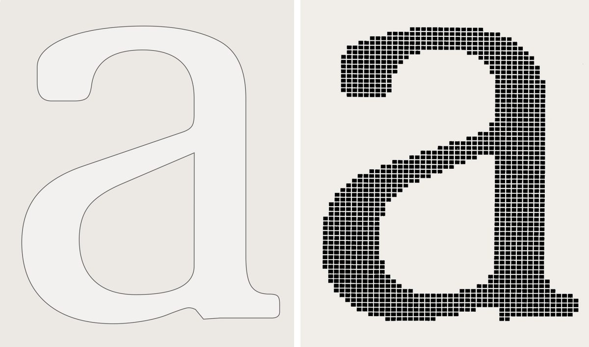
Additionally, Gerard had a natural inclination to explore legibility and reading contexts, in general everything that presented a challenge to him as a designer. His type Demos (1975), one of the first digital fonts, was an early experiment of legibility in screens. Unger told us that every pixel had been drawn by hand. I’ve always found the argument behind Demos’ design to be a core issue. Cathode ray screen rasterizers would drastically round off the characters’ angles. Unger’s idea was that, if they were rounded off in advance, the final (rasterized) result would be, at the very least, faithful to the original. In the end that is what design is all about, anticipating a problem with a clever and original response. In times where technology was a drastic impediment to the visual quality of a text, to sharpen one’s wit was essential. Today we have retina screens where it is almost impossible to perceive a single pixel, and still most typefaces lack creativity.
The ‘Unger’ style
Despite his Nordic imprint, huge height and poise, and in appearance being distant and reserved, Gerard hardly ever concealed his emotions. I remember when they showcased Buena Vista Social Club in the campus, Wim Wender’s celebrated documentary about Cuban musicians of bygone days, expectations of the film were high and some of the MA students we had gone along with some teachers. I think we were all very moved, but just as we left the theatre I was surprised to see Gerard especially moved and with tears in his eyes.
On another occasion when the newspaper USA Today had confirmed the licensing of his Gulliver type, Gerard was very happy and did not hold back when telling us the news and some details. Much in the same way he confided to us, somewhat upset, how a well-known architect, referring to the anatomy of his typefaces, had said that ‘Unger was happy to add and subtract serifs out of the same old letters’. Maybe teaching classes helped him catalyze some of his emotions. It sure happens to us all. And that’s a good thing, because we’ve all learned so much from it.
Now, about this last episode. Any human being sensitive enough to analyze all of Unger’s types will see that almost every time you’re dealing with a similar structure, slender, very much aware of its spacing (as a proper Dutchman he’s learnt to take advantage of the land, even to steal it away from water!), of sharp edges and large x-height (added to the already increased letter size within the body, a characteristic of all of Unger’s types). Arguments for a certain modulation and attire vary constantly from one design to another, but the game is always played on top of a skeleton that is, almost in every case, an ‘Unger skeleton’.
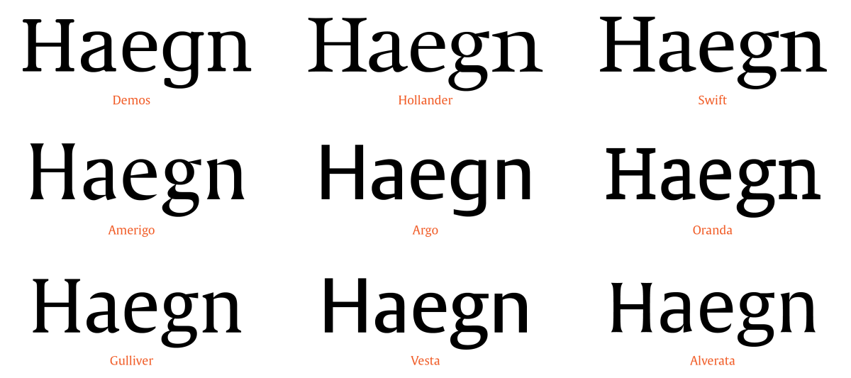
In time I realized that Unger’s design strategy had something significant in itself that one could learn from: It is possible to freely interpret the outfit of a letterform (its contrast and modulation, presence or absence of serifs, shape of exit strokes), as long as the letterform remains faithful to the skeleton. In Unger’s case it fits a particular skeleton, the ‘Unger skeleton’, manifested in his entire life’s work, from Demos to Alverata (with the clear exception of Flora, an upright cursive). So it is not that Unger was stuck in a repeated formula, as the aforementioned architect suggested, but rather he found ‘his’ style, the solution that perfectly expressed his own thinking. One of Unger’s legacies, besides his undoubtedly perennial work, is to have forged the way of thinking type as a duality: On the one hand the skeleton, on the other the build, inseparable elements in practice but individualized through the intellect. 5
Perfection in every curve
Another design lesson from Gerard I’ve come to understand in time: The confidence that comes with drawing with precision. In Unger’s designs precision is a highly visible quality. And I’m not only referring to the fact that his characters are impeccably drawn, but also that precision in itself is expressed as a design characteristic. Said perfectionism in the drawing of letterforms is linked to various aspects, I just want to point out one in particular now. Pencil drawings, those that every designer loves to sketch in their notebook, allow a juxtaposition of virtually infinite smooth traces, as they were a choir of several voices. When our eyes see that juxtaposition they inevitably distill a single curve that is sort of an average between all of the curves. That is why pencil sketches are so attractive, they allow each person to resonate with the soloist that better suits them. However, when that drawing is transferred to a digital environment, or is directly traced onto the screen, the charming juxtaposition fades away and is replaced by a single curve, black on white, binary, fatal, that has to be as perfect and fortunate as possible if we want it to represent the choir of the initial drawing.
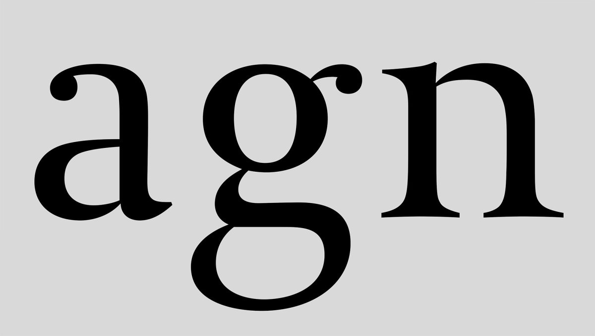
A quality typeface demands quality in drawing. And that quality is equal to the degree of conviction of the drawer. Quality typefaces do not exist by chance. 6 It is not the instrument or the method, nor is it the hand that draws, or the arm, not even the brain. It is the soul that draws. There is a connection, deep down, between a work and its author. And only when there is a conviction in mind and heart there will be quality in the result, regardless of the method or instrument used. In Gerard, that conviction is imbued by his personality. Unger’s types are slender and elegant just as his figure, his pace and his conversation. 7
Typefaces designed with a deep conviction imply a superlative drawing job, every curve must be coherent with the entire character, every character with the entire font, every font with the family it is in. This criterion of quality associated to a conviction, one might even say ‘spiritual’, transcends the mere idea of technical quality. In Unger you have drawing quality, legibility and precision as the raw materials of the design.

North and South
Gerard was a man of the world, very conscious of cultural differences, as is any decent Dutchman. The prologue he wrote for the catalogue Lettres Françaises (compiled by Jean François Porchez, designed by Philippe Millot, and published in 1998 by the ADPF and ATypI), entitled ‘La frontière de la bière et du vin’ (The Frontier of Beer and Wine) is to me one of his most endearing and pedagogical writings: A diagonal line divides Europe from North to South into two vast regions, the beer’s region and the wine’s region. 8 From the very beginning I found that a smart outlook on cultural identities in Europe is quintessential to typography and I dedicated myself to explore the relations that exist between typography and languages. Gerard made key observations in my writings in Reading. 9
Years later, the Catholic University of Chile, for the second edition of their Diploma in Typography, would invite Gerard as an international speaker. I lived in Mexico at the time and was also summoned to participate in that program, a few weeks later than Unger. When Gerard found I too was attending, he proposed the symposium’s subject should be about identity and language, and that every one of us should share their own visions in what would be a two-sided conversation. I felt deeply flattered, of course. Gerard remembered that this had been a favorite topic for me in Reading. Unger was someone who truly interacted with students, he cared about knowing your point of view and your interests, and suggested designs to observe, authors to consult, articles to read.
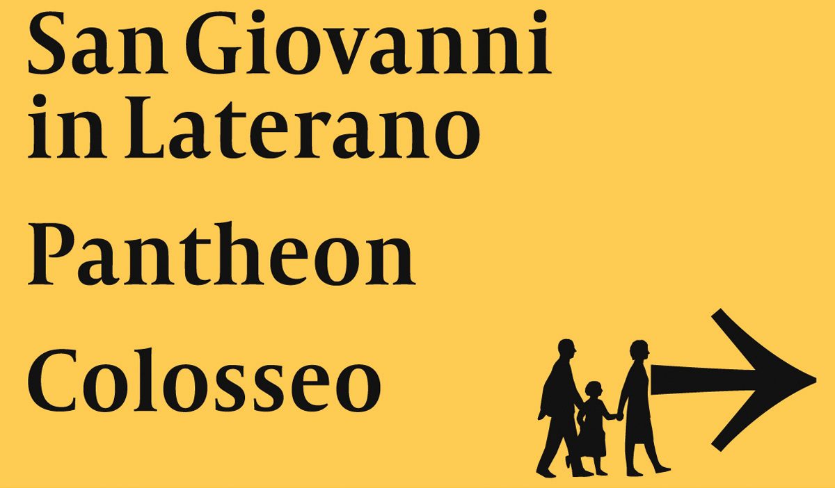
Another anecdote that paints a clear picture of his cultural awareness. Since 1997 Gerard was designing a typeface for the mega-event Jubilee in Rome that would take place in the year 2000. Millions of pilgrims and tourists would visit Rome on that occasion and a special information and orientation system would be set up for which a design of a new typeface would be required. A call was launched and Unger’s proposal was chosen. The project was developed but never applied. On one of his visits to Reading in 1999 he seemed annoyed by this and confided to us that the people managing the project in Rome were more concerned about the length of the skirt in the pictogram of women, and other details of that sort, rather than moving the project forward, which grew the Dutch team tired until they finally quitted the project and abandoned it. The typeface was called Capitolium and Unger made an adaptation for newspapers called Capitolium News. This story is rigorously accounted for by Unger himself in Typography Papers 3 (pages 61-73) with quite an optimistic tone and an assurance that the project would be fulfilled, but most of all with a flare of irony and humor about the mishaps and differences in idiosyncrasies between the Dutch and the Italians, that seemed to surface in this case.
Relationship with history
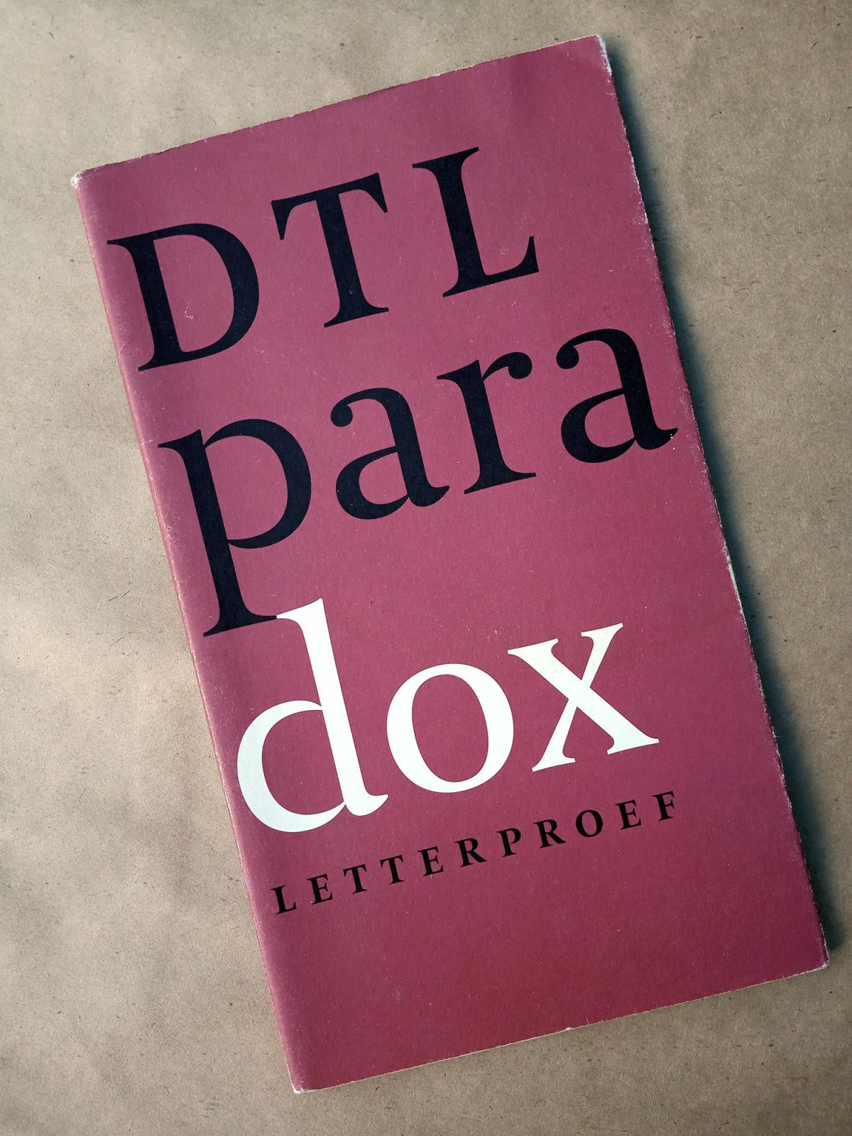
One day Unger came to the class and handed out to the students a laser printed specimen of the type he was working on at that time, Paradox (published by the Dutch Type Library a little later), basically modern (in its Ungerian skeleton), of a strong contrast and somewhat ornamental, even neoclassical in its details but definitely sober, just like all of Unger’s designs, without peculiarities that could disrupt the design as a whole. In the Paradox DTL specimen Frank Blokland quotes as a style reference Firmin Didot’s archetypical modern style, (inspired in turn) by Philippe Grandjean’s ‘Romain du Roi’, also Jacques François Rosart’s petit canon italique body (the 18th c. Belgian punchcutter who cut several display bodies for the Enschedé in Haarlem), but also a 17th c. copyist style belonging to the French calligrapher Nicolas Jarry (please do not confuse with the Chilean tennis player with the same name). What was really funny was listening to Unger’s explanation of why he had baptized it “Paradox”. Historically, what is ornamental was specially used in big bodies in labels and titles, not for immersive text sizes. However, the new printing technologies allow today the use of more refined and ornamental styles in text copy. 10
Gerard seemed to have some kind of ambivalence with the revivals or interpretations of historical models. On one occasion he told me that he’d ‘rather make his own designs than mess around with other people’s work’. I thought he was being too strict with himself. Of course no matter how valuable a specific historical rescue can be, it is clear that every new type design always relates with the past. 11 However, his own Hollander design is a good attempt to show the traditional Dutch style, in line with Jan Van Krimpen’s principles and more specifically with his Haarlem type.


Eventually, when I consulted Gerard about 17th century type references, he immediately advised me to read the chapter devoted to Baroque in Haiman’s book about Nicholas Kis. 12
Today I think Gerard had changed over time his idea of how to relate with the past. Looking back on his work it seems possible to believe that his lectures years in Reading might have provided him with a closer approach to historical awareness, a pretty natural transformation that occurs among graphic designers: In the first designs the approach is usually more graphic, more independent of calligraphy and tradition, and as the understanding of letterforms matures one reaches a more conciliatory view with history. Jan Tschichold’s case is extreme, 13 but without reaching such level of radicalism, this seems to be a usual trend among designers.
Also Unger referred that, for the design of Capitolium, James Mosley provided him with references on Giovanfrancesco Cresci (Typography Papers nº3, 1998). Mosley being a scholar in Italian Rennaisance and particularly aware of Cresci’s work, this must have resulted in a fruitful exchange for both. Let us all agree that it’s not the same to sit alone facing the library of the world than to receive the orientation of such a grand type historian as James Mosley. Likewise, Unger got used to supporting his new designs by means of historical references. These quests in history grew more formal until he started off his PhD at Leyden University, which he finished in 2013. 14 Alverata is the practical project that allegedly reflects his research on epigraphic inscriptions in Romanesque times. Even though it seems to me less interesting than other of his typefaces which I consider superb (Gulliver, Paradox, Capitolium, Amerigo!), Alverata is unsettling because it seems to blend for once all of Unger’s interests: The quest for identity, a contemporary design with historical reconciliation, the thirst for research and for the discovery of hidden pearls from the past (a kind of Sherlock Holmes’ muscle, maybe present in all designers?), the stylistic research within one family (regular, informal, irregular styles), and finally, also the academic recognition of having completed a PhD.
In his last book Theory of Type Design (p.37) Gerard made quite clear his position about history: ‘A benefit of knowing about the history of type design is the possibility to build on the past, to chart developments from past to present, and to extend this into the future. This can be done by staying close to ancient historical models or to more recent examples, or by striving for maximum originality within all the conditions entailed by type design, many of which have a long history. The originality of a type design can only be measured through comparison with earlier ones, and, of course, with contemporary designs.’ I believe that in this contrast, somehow extreme, of possible design attitudes, Gerard pictured himself clearly in the second group, that is to say, those designers searching for originality.
On Jan van Krimpen
The image of Jan van Krimpen that Unger portrayed in his lectures I believe describes quite well the vision he himself would later have of a type designer’s work. Unger took delight in the fact that Van Krimpen, belonging to a peasant family from the countryside, was truly drawn to urban sophistications (history of mankind) and he then took to smoking a pipe, wore linen suits, and even modified his tone and manner of speaking to pretend he belonged to a social class that was not his own. This apparently resulted in the indifference or rejection of those whom he intended to approach as a friend. My friend Feike de Jong always explains to me that the Dutch do not have three different social classes as in most parts of the world, but around twenty four or twenty five, and that in a conversation between Dutch, language helps to detect the interlocutor’s exact socio cultural level.
Perennial tracks
By and large one can say that there are two big currents in Dutch design: one based on tradition and another one more groundbreaking, irreverent. After World War II these trends become more archetypical. To learn more about this subject the book by Jan Middendorp Dutch Type, recently reprinted, is a must.
When it comes to type design, Jan van Krimpen is a key link because it blends modernism with tradition. He is the one to open up the game by daring to design types respectful of the Dutch tradition, developed in the 17th century’s first decades (Hendrik van den Keere, Christoffel van Dijck, the Belgian Nicholas Briot, the French Pierre Haultin), but with a modern outfit, precise, sharp and fair. This allows Van Krimpen’s following generations appearing on stage (Sem Hartz, Dick Doojies, Chris Brand, Gerrit Noordzij, Bram de Does, Gerard Unger) to be free to imagine a clear, legible, modern letter, in harmony with technological changes (from lead to photocomposition and to digital), but also respectful of tradition. And even more so with the last two (De Does and Unger) those new types would coin a huge sense of historical synthesis, refinement and character.
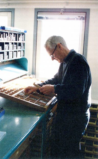
Bram de Does is undoubtedly the most purist one of all. For him all typefaces are little less than a corrupted version of Nicolas Jenson’s original roman. And of course he was right. Bram will distill in his only two typefaces, Trinité and Lexicon, the quintessence of harmony between modernity and history, between simplicity and expression, between rigor and humanism. Trinité and Lexicon are the two ferraris of the 20th c. typography.
Gerard Unger, a contemporary of Bram, takes the explorer’s road and allows himself to play with the available diversity, to experiment. That road could be seen as a wide range going from modernism (close to Wim Crowel, in fact at the beginning he worked in Crowel’s studio) to a modernism reconciled with history (in the path of Van Krimpen’s). Therefore his work provides us with more information as a thermometer of times, it has greater value in terms of a typographical Zeitgeist. And for this reason, it is not surprising that his designs are better known worldwide. This also goes hand in hand with a more extrovert and ambitious personality (compared to Bram who chooses to take a step back from the world).
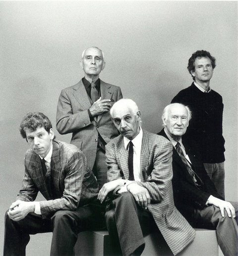
Bram de Does and Gerard Unger, both key figures to understand the last 50 years in type design, are undoubtedly the most remarkable type designers of the contemporary Dutch school. They both passed away only recently, but their work has become immortal.
Gerard Unger will always be a key reference for responsible typography. A designer with a deep human sense of reading, with a powerful sense of synthesis, and also a generous inspiring professor. Being aware of the diversity that exists and exploring it is a must before being able to synthesize it. Unger was a remarkable distiller of forms, either old or new, of our alphabet, just like a perfumer who devotes his life to distilling the infinite possible mists so as to grasp the very essence of the flower.
Río Ceballos, Córdoba, Argentina
11.28.2018
(translated by Aki Guerineau)
References and further reading
—Paul Bennet, Postscripts on Dwiggins. New York: The Typohiles, 1960 (Typophile Chap Books nº 35 y 36).
—Exhibition brochure Excoffon, Paris: Excoffon Conseil, 1986.
—György Haiman, Nicholas Kis. A Hungarian punch-cutter and printer 1650-1702. San Francisco: Jack W. Stauffacher & the Grenwood press, 1983.
—Bruce Kennet, W. A. Dwiggins: A Life in Design, San Francisco: Letterform Archive, 2017.
—Jan Middendorp, Dutch Type, Rotterdam: 010, 2004.
—Mosley, James. “Giovan Francesco Cresci and the Baroque Letter in Rome”, in Typography Papers 6, 2005, pp. 115-155.
—Gerard Unger, “A type design for Rome and the year 2000” in Typography Papers nº 3, Reading (UK): University of Reading, 1998.
—Gerard Unger, Alverata, a present-day, European typeface with roots in the middle ages. Dissertation to obtain a doctor’s degree in Leiden University, 2013.
—Gerard Unger, “Avant-propos” in Chamaret, Gineste, Morlighem, Roger Excoffon et la fonderie Olive, Paris: Ypsilon, 2010.
—Gerard Unger, “Experimental no. 223, a newspaper typeface, designed by W.A. Dwiggins”, Quaerendo, 9.4 (1981), pp. 302–24.
—Gerard Unger, “La frontière de la bière et du vin” in Lettres Françaises, Paris: ATypI y ADPF, 1998.
—Gerard Unger, “The design of a typeface” in Visible Language, 13.2 (1979), 134–49 (p. 141).
—Gerard Unger, Theory of type design, Rotterdam: nai010, 2018.
—Gerard Unger, While you’re reading, New York: Mark Batty, 2007.
Web references:
https://articles.c-a-s-t.com/the-inner-consistency-of-gerard-unger-7a42add9e900
https://artjewelryforum.org/in-memoriam-marjan-unger?fbclid=IwAR1LeBivnQKzpWYFEd4_dpiAAScH42iTZxBvvhmWkHjW-10HH5mH06njoC4
https://vimeo.com/84208612 [Documentary on Bram de Does]
http://www.gerardunger.com
- Involuntarily or not, the work of Kis was always mistakenly named after the Dutch founder Anton Janson, until investigations by György Haiman and Harry Carter revealed its true authorship. ↩
- Amongst other interviewees, Gerard appears in two occasions: First he refers to a type specimen designed by Bram (close to minute 3:00) and later (minute 44) he describes the very closed counterforms of Times New Roman in the context of describing the design of Lexicon. ↩
- One day a curious note arrived from a Marianne Excoffon, Roger’s granddaughter, thanking me for having publicly prized his grandfather’s work –I had just mentioned him in a piece–, and she offered me a catalogue of Excoffon’s posthumous exposition of 1986. The catalogue is awesome, very sui generis, entirely composed in Antique Olive, and splashed with extracts of snappy opinions from Roger about a variety of issues (most likely extracted from his passionate interventions in the Rencontres de Lure). Having made contact with Excoffon’s granddaughter led to a dinner at Excoffon’s daughter’s house, Martine Excoffon-Rosaz, in Paris, to which both a designer friend of mine, Paule Dalens, and myself were invited. There we considered the possibility of a publication, that for personal reasons we couldn’t commit to (Paule was pregnant of her first, beautiful child). ↩
- W. A. Dwiggins: A Life in Design, San Francisco: Letterform Archive, 2017. 4. This book was successfully crowdfunded. ↩
- Just like the Aristotelian dualities from which we are all born into in the West: Form and matter, substance and accident, potential and action. And we’ve only come this far. ↩
- In the era of the banal, where ‘digital lettering’ attempts to transcend by over-estimating the spontaneous and gestural work above that which is focused or meditative, just because, and because it works better with our accelerated lifestyle, just like fast-food trumps slow-food, all the time we see young generations (students) having difficulties in learning the concept of quality, and are unable to locate the elements that make a drawing have, for example, quality. Many visual arts professors complain about this very thing. Ever since art has been allowed to disregard the “manual’ making of a well-crafted object, that manages to manifest the talent or the effort of the artist or artisan, students (and given time schools will too) have ceased to identify value in the quality of what is made. Effort is replaced by discourse. ↩
- Gerard was very keen of his clothes, something he tried to surprise with I guess. In Unger you would always find purple, violet, sometimes pink, in a shirt, in a sweater. Among the very sober Europeans in terms of taste compared to the sunnier regions that stimulate a unbiased use of color, this always caught my attention. However in Gerard’s family design was especially valued. His wife, Marjan, charming, very knowledgeable in art history, possessed an important collection of designed jewelry (that she donated entirely to the Rijkmuseum before her death in 2018, five months prior to Gerard). And the postmodern house where the family lived from 1981 had been designed by the architect Mart van Schijndel. The house was also donated by the Unger family to a Dutch society that protects buildings of historical value. ↩
- Richard Southall corrected him by saying that the line actually divided the region from the butter-based kitchen of the olive oil-based kitchen region. ↩
- In time I was able to find historical references that define the boundaries of typographical schools, both regional and national, and putting together a view of my own about the development of typographical styles, and I’ve tried to convey that to my students so that they could have concrete tools to approach the typographical diversity out there. Nowadays, in the age of hybrid typefaces, those stylistic landscapes appear to be fading out but are in fact present, and I’m convinced that if one studies them and becomes familiarized with them, the transformation process will be a joyous and permanent one. ↩
- Having said that nonetheless we would have to remember types from the 18th c. cut by the German punchcutter Johan Michael Fleischmann for the Ensechedé in Haarlem, of great ornamental awareness and at the same time a superlative legibility in body text sizes. ↩
- For example in Ricardo Orocco’s interview “The Inner Consistency Of Gerard Unger” he says that he has tried to make a typographical rescue ‘just as Matthew Carter has done’ but wasn’t able to do so, simply couln’t do any of it. https://articles.c-a-s-t.com/the-inner-consistency-of-gerard-unger-7a42add9e900 ↩
- György Haiman, Nicholas Kis. A Hungarian punch-cutter and printer 1650-1702. San Francisco: Jack W. Stauffacher & the Grenwood press, 1983. A great book. ↩
- It is well known that a young Tschichold edits his New Typography manifest ‘definitely’ breaking the traditional canons of typographic composition, and at an older age he ‘regrets’ the youthful impulse and fully embraces tradition, and would even end up designing his own version of Garamond, named Sabon as a tribute to Jacques Sabon, foundry assistant of Claude Garamond. ↩
- The thesis is available in Dutch on Leiden University’s site. The English title of the thesis is: Alverata, a present-day, European typeface with roots in the middle ages. Dissertation to obtain a doctor’s degree in Leiden University, 2013. ↩