Articles tagged under “Frederic Goudy”

Article

Written by Alejandro Lo Celso  |  15 September 2017

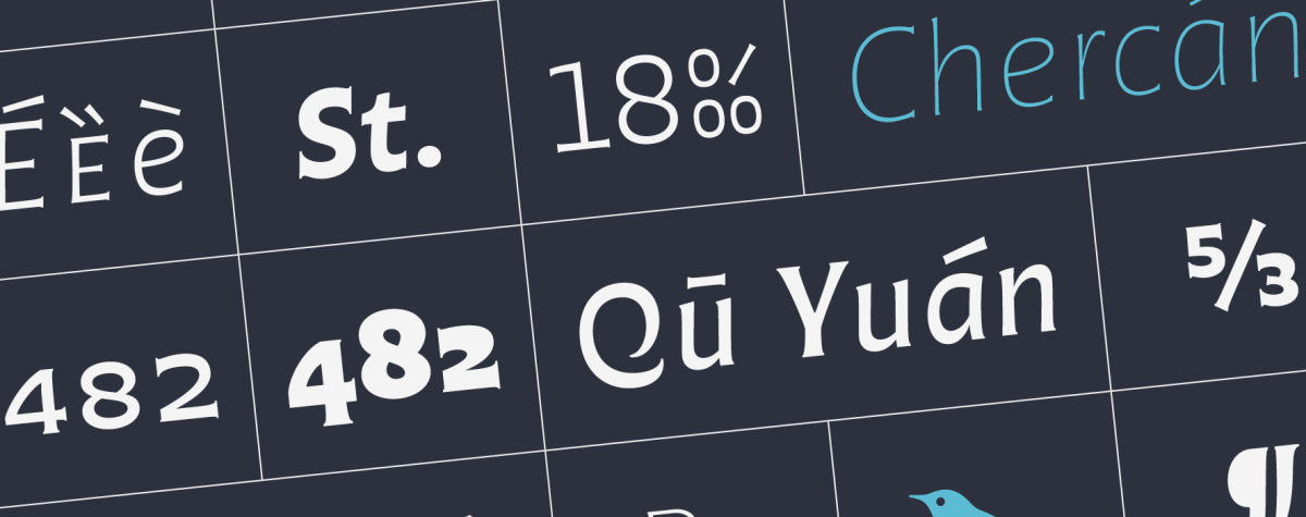
This typeface is named after the astonishing guitar player and singer Atahualpa Yupanqui, a central figure to Argentine folk music. ‘Don Ata’, as he was called, was a wise poet with a particularly sensitive view of the elements of nature as well as of the human condition, all of which he turned into compelling lyrics and magic songs. For years I dreamed about designing a typeface in his name. I imagined a firm, rough voice, though interpreted with delicate curves and a feel of warmth. After a few years of occasional sketching finally a spirit aroused in 2014. The initially vague forms turned into precise letterforms and with time into a family of fonts. Now the type Atahualpa finally sees the light. I’m happy. Here I invite you to unveil all the secrets behind the scene, discover the clues of the inspiration and the design process, and enjoy some footnotes from our design kitchen.  Read
Article

Written by Alejandro Lo Celso  |  5 December 2016

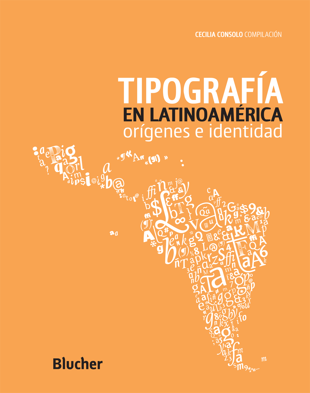
Portada de Tipografía en Latinoamérica editado por Blucher, San Pablo, 2013. target: _blank

Primera de dos entregas del 1er capítulo del libro “Tipografía en Latinoamérica. Orígenes e identidad”, editado por Cecilia Consolo y publicado por Blucher en Brasil, 2013. Sus editores han aceptado amablemente publicarlo aquí. Es una mirada retrospectiva y muy personal de la historia de la tipografía europea desde Gutenberg a la era digital. Pretender abarcar semejante lapso de tiempo en tan poco espacio habilita a posibles exageraciones y reduccionismos. El objetivo ha sido intentar provocar al lector a continuar su propia búsqueda. La primera parte toca en los episodios significativos desde el tipo móvil alemán de fines del s. XV, la escuela humanista italiana, Jenson, Manucio y Griffo, hasta la Edad de Oro francesa del s. XVI, de Tory a Garamond y Robert Granjon. La 2da parte retoma en el barroco neerlandés del s. XVII e intenta referir los hitos fundamentales de la producción británica, ibérica, alemana, y holandesa, incluido el empuje en tipo digital de La Haya. A modo didáctico, imágenes comparativas de anatomía y evolución de las formas tipográficas en Occidente se han sumado al final de la 2da parte. (Escrito en Ciudad de México, 10 de enero de 2010.)  Read