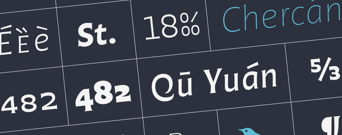
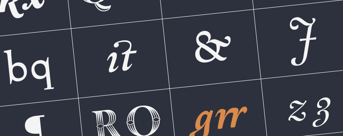
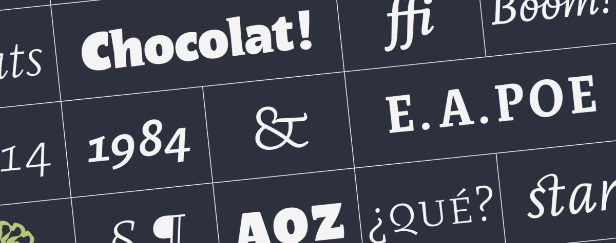
The Perec super family adds a new style: the Perec Scripte, a script variant that has been a major design and production challenge. Perec Scripte includes two styles of “writing”: bound and unbound letters, both declined in six weights with large linguistic support and many typographic goodies, as well as a decorative version with graphic impact. Here I share with you the secrets of the slow firing of these fonts, a design process that took many years of exploration, drawing, testing, refinement, passion. Read
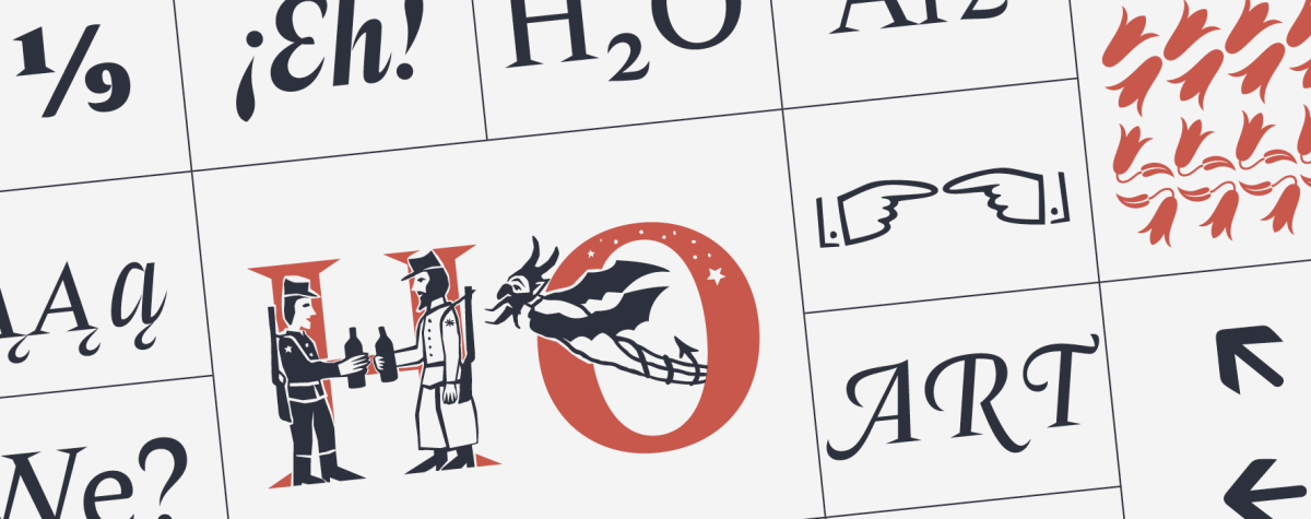
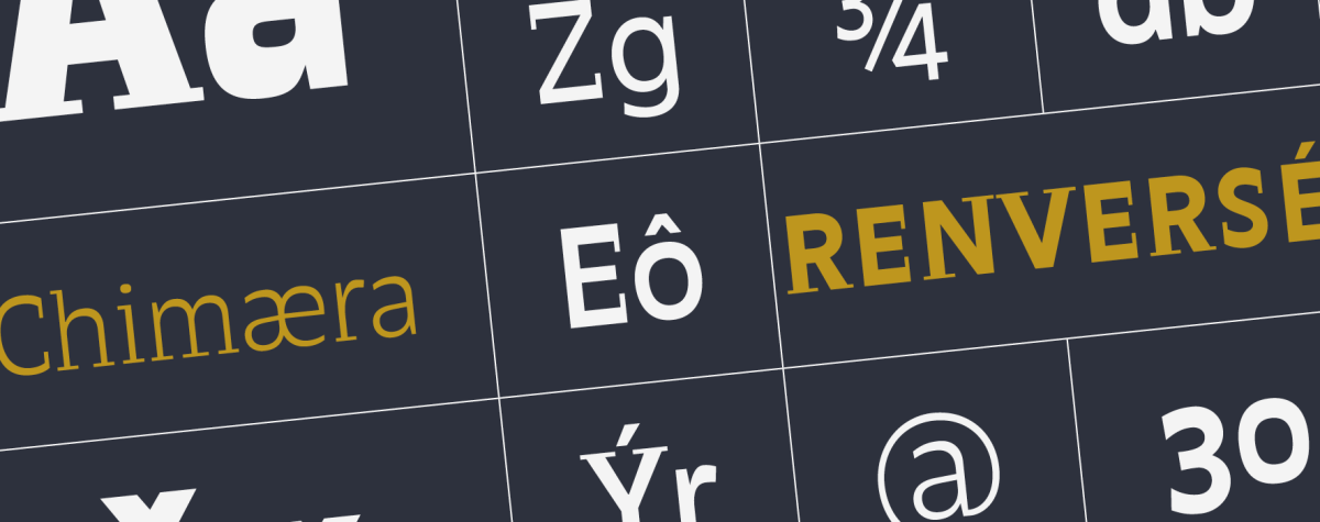
For those of you who know us, you know that we like projects that are hard to classify. This is one of them, and it is one that we like very much, the Perec family: a sans grotesque that has a lot to offer. From its origin it responded to quite complex artistic and conceptual criteria, as a tribute to the multifaceted work of French writer Georges Perec, but over time with the addition of new styles it has become a versatile type system offering a diverse palette of easily combinable forms. Here we share with you a brief overview of the design process and the cuisine of these fonts. Just remember that new Perec styles are being prepared! It is an ongoing project. It could not be otherwise, Georges Perec would have wanted it that way. Read
Second and final installment of Tere Schultz’s text on Tuscan letters. Those decorative objects, delicate or extravagant, that inhabit the streets and typographic catalogues of all times, without losing an iota of expressive force. The product of ornamental ingenuity, Tuscan vernaculars dress the street signs of Mexico as much as the stained glass windows of Paris, the ‘fileteados porteños’ of Buenos Aires or the hulls of fishing boats in the Amazon waters. Against this notorious and implausible decorative ubiquity, which alarms many, in the first part of this article Schultz unfolded, like a healing balm, his hypothesis of how the Tuscan style would have been born of a mischievous interpretation of the inscriptions on stone. In this second chapter, it only remains to delight us with some examples of Tuscan vernaculars from some corners of the world. Read
Tere Schultz delivers a new literary and typographic divertimento for passionate readers. This time she follows one of her personal fixations: the Tuscan letters. Those ornamental objects, delicate or extravagant, that inhabit streets and typographic catalogs of all times, without losing an iota of expressive force. The product of decorative ingenuity, Tuscan vernaculars dress the street signs of Mexico as much as the stained glass windows of Paris, the ‘fileteado porteño’ of Buenos Aires signs or the hulls of fishing boats in the Amazon waters. However, this decorative ubiquity, notorious and implausible, alarms many. Fortunately, like a healing balm, Schultz will deploy here her original hypothesis, suspiciously unexplored, of how the Tuscan style would have been born from a mischievous interpretation of the stone inscriptions (wrongly) called lapidary. Although perhaps here the term ‘lapidary’ is appropriate, since the idea caught the author strolling through a cemetery. (Warning: sensitive material. Agnostic typographers and designers of little faith, please refrain). Read
Francisco Gálvez presents to us his daring reattempt at a type categorization, a much broader and versatile one, more suitable to our times. The author rethinks the values of preceding classifications and reinterprets them in a new model, one that does not seek to be a classification in itself but an original instrument to situate and study the diversity of today’s typefaces. Read
We are proud of this project: The design of a typeface for the Universidad Nacional de Córdoba in Argentina, an educational institution of more than 400 years, the first in the country and one of the earliest in the continent. As part of the celebration for the hundred years of the University Reform, which occurred in this house in 1918, the UNC commissioned PampaType the design of a typeface to address their multiple communication needs. The resulting design, ‘Reforma’, is a multi-form family with diverse styles. In this article we share a bit of context, all the design process, some of our drawings and production details, and a few insights harvested throughout this 3-year fruitful experience. Read
This essay was the original dissertation I wrote for the MA in Typeface Design at the University of Reading, UK, 2000. Since then it has met some popularity. It was slightly adjusted years later for its publication under TypeCulture.com and also under lpdme.org. Of course some references may feel out of date by now. However I believe its ideas and insights are mostly perennial. Read
Portada de Tipografía en Latinoamérica editado por Blucher, San Pablo, 2013.
Segunda y última entrega del 1er capítulo del libro “Tipografía en Latinoamérica. Orígenes e identidad”, editado por Cecilia Consolo y publicado por Blucher en Brasil, 2013. Sus editores han aceptado amablemente publicarlo aquí. Es una mirada retrospectiva y muy personal de la historia de la tipografía europea desde Gutenberg a la era digital. Pretender abarcar semejante lapso de tiempo en tan poco espacio habilita a posibles exageraciones y reduccionismos. El objetivo ha sido intentar provocar al lector a continuar su propia búsqueda. La primera parte toca en los episodios significativos desde el tipo móvil alemán de fines del s. XV, la escuela humanista italiana, Jenson, Manucio y Griffo, la Edad de Oro francesa del s. XVI, de Tory a Garamond y Robert Granjon. La 2da parte retoma en el barroco neerlandés del s. XVII e intenta referir los hitos fundamentales de la producción británica, ibérica, alemana, y holandesa, incluido el empuje en tipo digital de La Haya. A modo didáctico, imágenes comparativas de anatomía y evolución de las formas tipográficas se han sumado al final de esta 2da parte. (Escrito en Ciudad de México, 10 de enero de 2010.) Read
Portada de Tipografía en Latinoamérica editado por Blucher, San Pablo, 2013.
Primera de dos entregas del 1er capítulo del libro “Tipografía en Latinoamérica. Orígenes e identidad”, editado por Cecilia Consolo y publicado por Blucher en Brasil, 2013. Sus editores han aceptado amablemente publicarlo aquí. Es una mirada retrospectiva y muy personal de la historia de la tipografía europea desde Gutenberg a la era digital. Pretender abarcar semejante lapso de tiempo en tan poco espacio habilita a posibles exageraciones y reduccionismos. El objetivo ha sido intentar provocar al lector a continuar su propia búsqueda. La primera parte toca en los episodios significativos desde el tipo móvil alemán de fines del s. XV, la escuela humanista italiana, Jenson, Manucio y Griffo, hasta la Edad de Oro francesa del s. XVI, de Tory a Garamond y Robert Granjon. La 2da parte retoma en el barroco neerlandés del s. XVII e intenta referir los hitos fundamentales de la producción británica, ibérica, alemana, y holandesa, incluido el empuje en tipo digital de La Haya. A modo didáctico, imágenes comparativas de anatomía y evolución de las formas tipográficas en Occidente se han sumado al final de la 2da parte. (Escrito en Ciudad de México, 10 de enero de 2010.) Read
This detectivesque chronicle written by journalist Feike de Jong reopened the chests of the mysterious case of an early 17th century punch cutter from The Netherlands named Nicolaes Briot. Originally published by the Czech magazine TYPO, in their issue of Spring 2011, the editors have kindly allowed us to reproduce it here. Stay tuned, the second part of this story is under editing. (The Briot project is part of a wider revival program on historical sources carried out by PampaType since 2004. In the case of Briot, it has been so far the result of a collaboration between John Lane and Alejandro Lo Celso.) Read
This short article touches on the issue of typeface revivalism. It describes the early enthusiasm of recovering type classics in the beginning of 20th century; then it states a revival case study under its multiple attempts; and finally discusses some polemic matters around the subject. This text was part of the output as a student of the MA in Typeface Design, at the University of Reading, in May 2000. The good parts shall be credited to my tutor at the time, Dr. Christopher Burke. On the contrary all the mistakes are mine. In further texts we shall come back to this extremely important subject. Read
The design of the Amster type family implied a process of creation and maturing of seven years. In this article Francisco Gálvez, its designer, gives us some of his various insights around that process, its referents and inspirations. Read
Since its release Margarita have met much sympathy. No doubt it is a passionate type. One can easily relate its anatomy to Romanticism, Neoclassicism, or for that matter to the deeply emotional character everyone ascribe to Italians! a bit of a cliché… Read
I wrote this essay in 2000 when I was a student at the MA in Type Design at the University of Reading. I intended to explore the history and development of multi-style type families across the 20th century. Nowadays the idea of 'series' is much present in current type industry, almost every new family comes in different styles. Fluid digital technology on one side, the constant push of the font industry on the other, have all made type design to challenge traditional classification approaches. In that sense I think this text has still some contribution to make. Read