Articles tagged under “Article”

Article

Written by Juan Carlos Cué  |  31 July 2017

El universo de la tipografía está lleno de sutilezas y detalles, de formas que transmiten ideologías a través de sus trazos. El espécimen tipográfico es el mundo que antecede a la puesta en página y donde sobran pretextos para observar el color de la trama, el contraste, el espacio entre las líneas y las letras; es el lugar donde se originan las combinaciones infinitas de los signos que esperan inertes y que aún no toman sentido en un discurso, pero que son para disfrutarse. Esta reflexión pretende esbozar el vasto mundo de una herramienta tan importante, poco recurrida y bastante desaprovechada en nuestros días. Para entenderla, es preciso conocer sus orígenes y el desarrollo que tuvo en las distintas épocas. (Esta es la primera de tres entregas del texto.)  Read
Article

Written by Alejandro Lo Celso  |  10 April 2017

This essay was the original dissertation I wrote for the MA in Typeface Design at the University of Reading, UK, 2000. Since then it has met some popularity. It was slightly adjusted years later for its publication under TypeCulture.com and also under lpdme.org. Of course some references may feel out of date by now. However I believe its ideas and insights are mostly perennial.  Read

Article

Written by Alejandro Lo Celso  |  6 January 2017

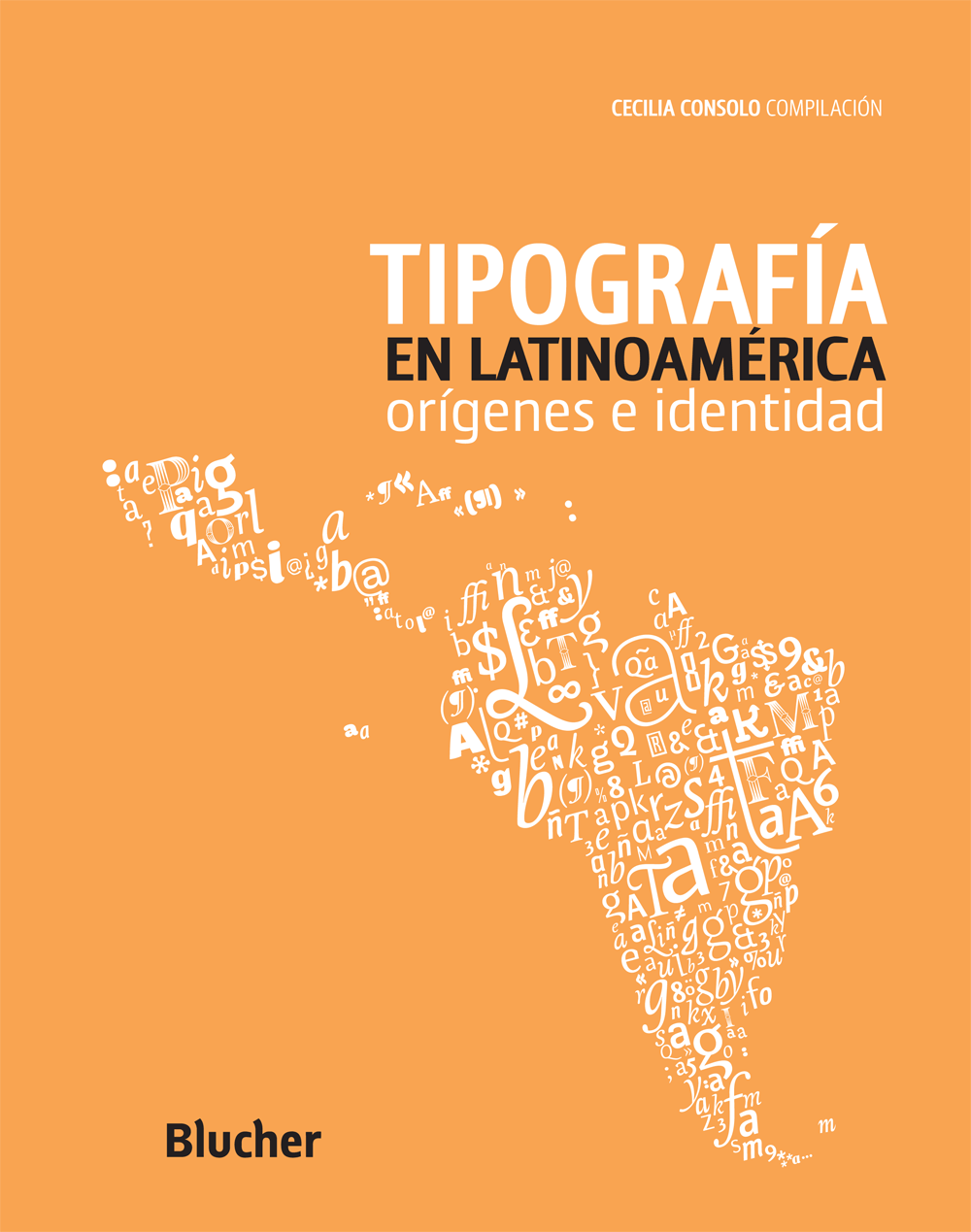
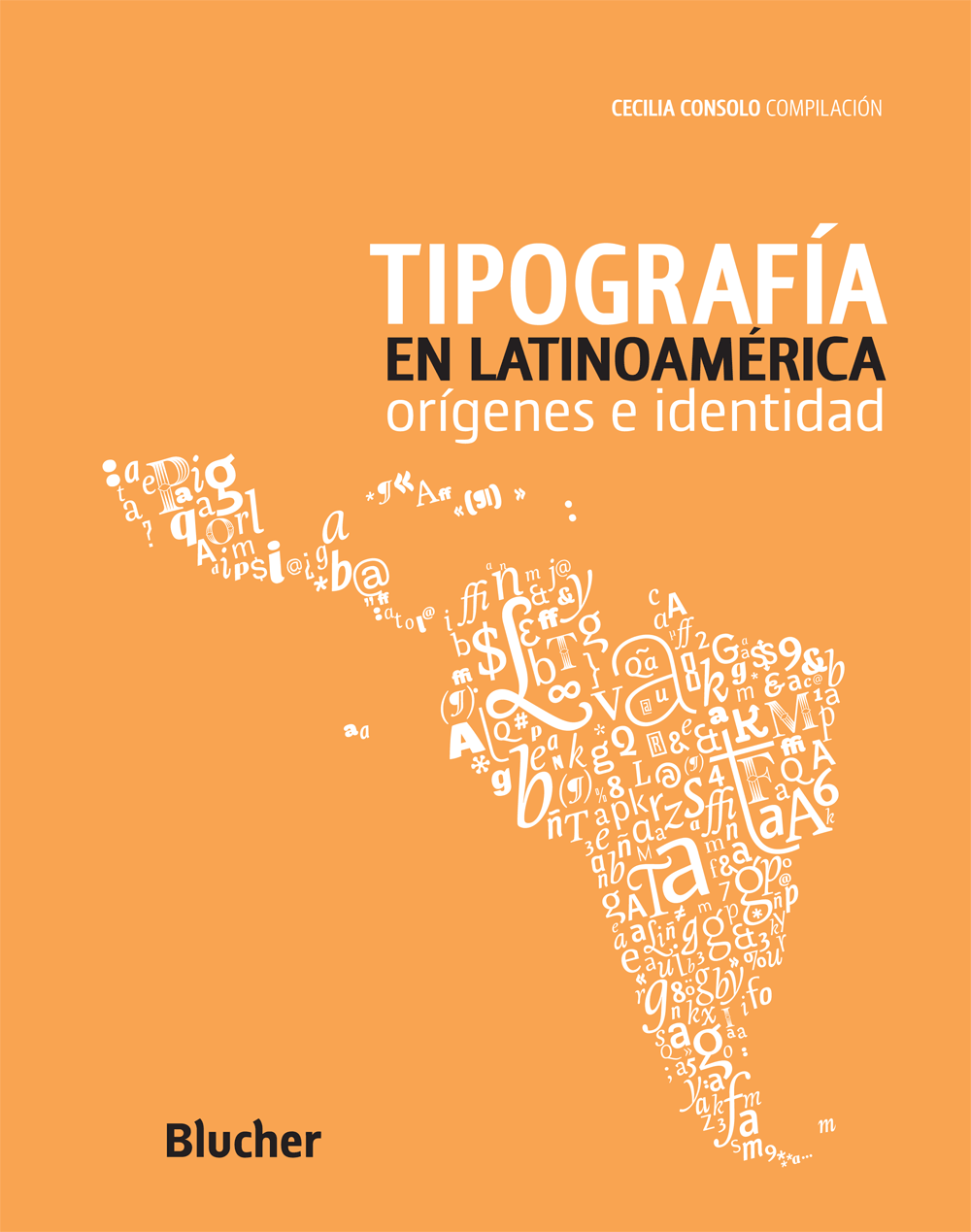
Portada de Tipografía en Latinoamérica editado por Blucher, San Pablo, 2013. target: _blank

Segunda y última entrega del 1er capítulo del libro “Tipografía en Latinoamérica. Orígenes e identidad”, editado por Cecilia Consolo y publicado por Blucher en Brasil, 2013. Sus editores han aceptado amablemente publicarlo aquí. Es una mirada retrospectiva y muy personal de la historia de la tipografía europea desde Gutenberg a la era digital. Pretender abarcar semejante lapso de tiempo en tan poco espacio habilita a posibles exageraciones y reduccionismos. El objetivo ha sido intentar provocar al lector a continuar su propia búsqueda. La primera parte toca en los episodios significativos desde el tipo móvil alemán de fines del s. XV, la escuela humanista italiana, Jenson, Manucio y Griffo, la Edad de Oro francesa del s. XVI, de Tory a Garamond y Robert Granjon. La 2da parte retoma en el barroco neerlandés del s. XVII e intenta referir los hitos fundamentales de la producción británica, ibérica, alemana, y holandesa, incluido el empuje en tipo digital de La Haya. A modo didáctico, imágenes comparativas de anatomía y evolución de las formas tipográficas se han sumado al final de esta 2da parte. (Escrito en Ciudad de México, 10 de enero de 2010.)  Read

Article

Written by Alejandro Lo Celso  |  5 December 2016

Portada de Tipografía en Latinoamérica editado por Blucher, San Pablo, 2013. target: _blank

Primera de dos entregas del 1er capítulo del libro “Tipografía en Latinoamérica. Orígenes e identidad”, editado por Cecilia Consolo y publicado por Blucher en Brasil, 2013. Sus editores han aceptado amablemente publicarlo aquí. Es una mirada retrospectiva y muy personal de la historia de la tipografía europea desde Gutenberg a la era digital. Pretender abarcar semejante lapso de tiempo en tan poco espacio habilita a posibles exageraciones y reduccionismos. El objetivo ha sido intentar provocar al lector a continuar su propia búsqueda. La primera parte toca en los episodios significativos desde el tipo móvil alemán de fines del s. XV, la escuela humanista italiana, Jenson, Manucio y Griffo, hasta la Edad de Oro francesa del s. XVI, de Tory a Garamond y Robert Granjon. La 2da parte retoma en el barroco neerlandés del s. XVII e intenta referir los hitos fundamentales de la producción británica, ibérica, alemana, y holandesa, incluido el empuje en tipo digital de La Haya. A modo didáctico, imágenes comparativas de anatomía y evolución de las formas tipográficas en Occidente se han sumado al final de la 2da parte. (Escrito en Ciudad de México, 10 de enero de 2010.)  Read

Article

Written by Feike de Jong  |  5 December 2016

This detectivesque chronicle written by journalist Feike de Jong reopened the chests of the mysterious case of an early 17th century punch cutter from The Netherlands named Nicolaes Briot. Originally published by the Czech magazine TYPO, in their issue of Spring 2011, the editors have kindly allowed us to reproduce it here. Stay tuned, the second part of this story is under editing. (The Briot project is part of a wider revival program on historical sources carried out by PampaType since 2004. In the case of Briot, it has been so far the result of a collaboration between John Lane and Alejandro Lo Celso.)  Read

Article

Written by Alejandro Lo Celso  |  23 November 2016

This short article touches on the issue of typeface revivalism. It describes the early enthusiasm of recovering type classics in the beginning of 20th century; then it states a revival case study under its multiple attempts; and finally discusses some polemic matters around the subject. This text was part of the output as a student of the MA in Typeface Design, at the University of Reading, in May 2000. The good parts shall be credited to my tutor at the time, Dr. Christopher Burke. On the contrary all the mistakes are mine. In further texts we shall come back to this extremely important subject.  Read

Article

Written by Alejandro Lo Celso  |  24 December 2004

I wrote this essay in 2000 when I was a student at the MA in Type Design at the University of Reading. I intended to explore the history and development of multi-style type families across the 20th century. Nowadays the idea of 'series' is much present in current type industry, almost every new family comes in different styles. Fluid digital technology on one side, the constant push of the font industry on the other, have all made type design to challenge traditional classification approaches. In that sense I think this text has still some contribution to make.  Read