Articles tagged under “Literature”

Article

Written by Paule Palacios Dalens  |  8 September 2024

What enigmatic relations of convergence and divergence are woven between literature and cinema? What secret devices aesthetically connect a film, its script-book and the editorial design of that book? These and other questions arise and unfold their singular charm in the pen of Paule Palacios-Dalens, an inquisitive Parisian designer equally passionate about book design, typography, literature and cinema. Her detailed tour begins with “Hiroshima Mon amour”, the famous film by Alain Resnais and scripted by Marguerite Duras. Only for equally passionate and curious readers, here is the translation of a revealing essay by Paule, originally published as “Hiroshima dans la Blanche. Marguerite Duras’s introduction to cinema” by the independent label 202 éditions, then in the French online cinema magazine Débordements. A gourmet delight for lovers of cinema, literature and design.  Read
Article

Written by Alejandro Lo Celso  |  24 November 2023

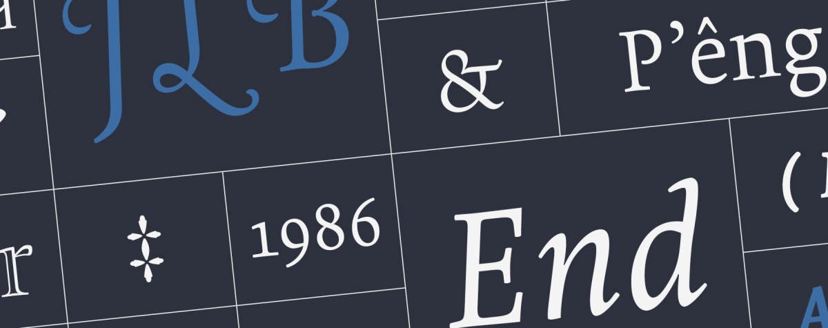
The Perec super family adds a new style: the Perec Scripte, a script variant that has been a major design and production challenge. Perec Scripte includes two styles of “writing”: bound and unbound letters, both declined in six weights with large linguistic support and many typographic goodies, as well as a decorative version with graphic impact. Here I share with you the secrets of the slow firing of these fonts, a design process that took many years of exploration, drawing, testing, refinement, passion.  Read

Type review

Written by Teresita Schultz de Carabobo  |  4 October 2018

El presente texto, una crítica a la tipografía Amster de Francisco Gálvez, constituía el prólogo que la autora hiciera para una pequeña pero poderosa publicación que aun no ha visto la luz. Hasta tanto esa edición física tome vida, anticipamos aquí este relato inextricable de la filosa pluma de Teresita Schultz que, no sin un puñado de disgresiones místicas que arrojan luz sobre los oscuros meandros de la historia del libro, nos invita a construir una mirada perspicaz frente al diseño de una tipografía, sofisticada y moderna, como es Amster. Tales disgresiones incluyen el diseño de iniciales, la iluminación de manuscritos medievales, las relaciones entre insectos y embutidos, y algunas cosas más. Hacia el final y para sorpresa de todos, este prólogo incluía cartas de lectores al parecer prematuramente anoticiados.  Read